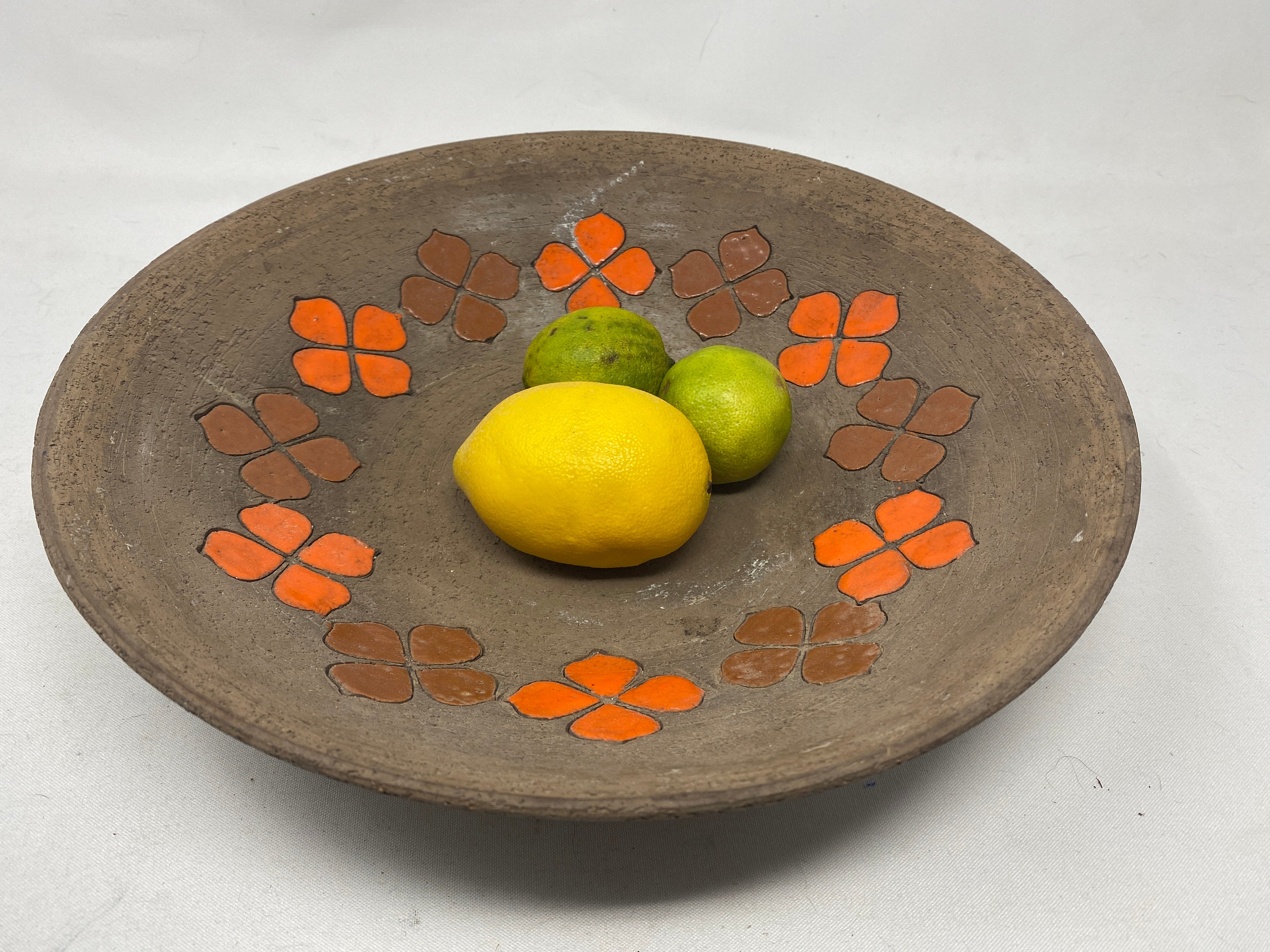
The other day, while having dinner with a friend, the question was posed: "What is your favorite color?" After thinking about colors that I like and others that I don't, I knew this wasn't an easy answer.
For starters, every color can be my favorite color, depending on the context. Seriously, context is everything! And if context doesn't matter, then my mood certainly does. And of course, lighting plays a huge role.
So, rather than going into a long-winded defense as to why I couldn't possibly have one favorite color, because it simply isn't fair to be so restrictive, I chose a different tactic. I made a statement: "Orange is the new neutral." Yes, I said that.
Orange is the new neutral. I mean, think about it... For starters, rather than simply state that it matches everything (which it kind of does!), let's break down why.
- It's a Complementary Color Powerhouse: Orange sits opposite blue on the color wheel. This means it creates a vibrant, dynamic contrast with anything blue – denim, navy suits, blue skies, blue eyes, blue-gray walls. This complementary relationship makes it surprisingly versatile.
- It Spans a Wide Spectrum: "Orange" isn't just one color. It ranges from the softest peach and apricot to vibrant tangerines and deep, burnt siennas. This spectrum allows it to work with a huge variety of other colors and moods.
- It's Both Warm and Cool: Depending on the undertones, orange can lean warm (think terracotta) or cool (think coral). This adaptability makes it surprisingly easy to integrate into different color schemes.
- It's Unexpected: We're so used to thinking of beige, gray, or white as neutrals that orange feels fresh and bold. It adds a pop of personality without being overwhelming.
- It's Grounded in Nature: Think of sunsets, autumn leaves, spices, and citrus fruits. Orange is deeply connected to the natural world, giving it an inherent sense of comfort and familiarity.
- It goes with everything: Just as I suspected, it turns out that orange pairs perfectly with colors across the spectrum: Pinks, yellows, and reds will give any design a sense of fun and energy. Muted earth tones like beige, brown, and grey, tend to give designs a more subtle, natural feel. And, Colors like green, blue, and purple, when paired with orange, create a sense of richness and sophistication.
So, how can you use orange as a neutral?
- Accessories: Start small with a throw pillow, a vase, a scarf, or a piece of artwork.
- Accent Walls: A burnt orange accent wall can add warmth and depth to a room without being overwhelming.
- Furniture: A vintage orange chair or a modern terracotta sofa can be a stunning focal point.
- Fashion: An orange handbag, a pair of shoes, or even a bold orange lipstick can elevate a neutral outfit.
I'm not saying you should ditch your grays and beiges entirely. But next time you're looking for a color that's surprisingly versatile, surprisingly sophisticated, and undeniably cheerful, give orange a try. You might just find that it's the new neutral you've been searching for.
By David Braselton
